A Blog
To Watch
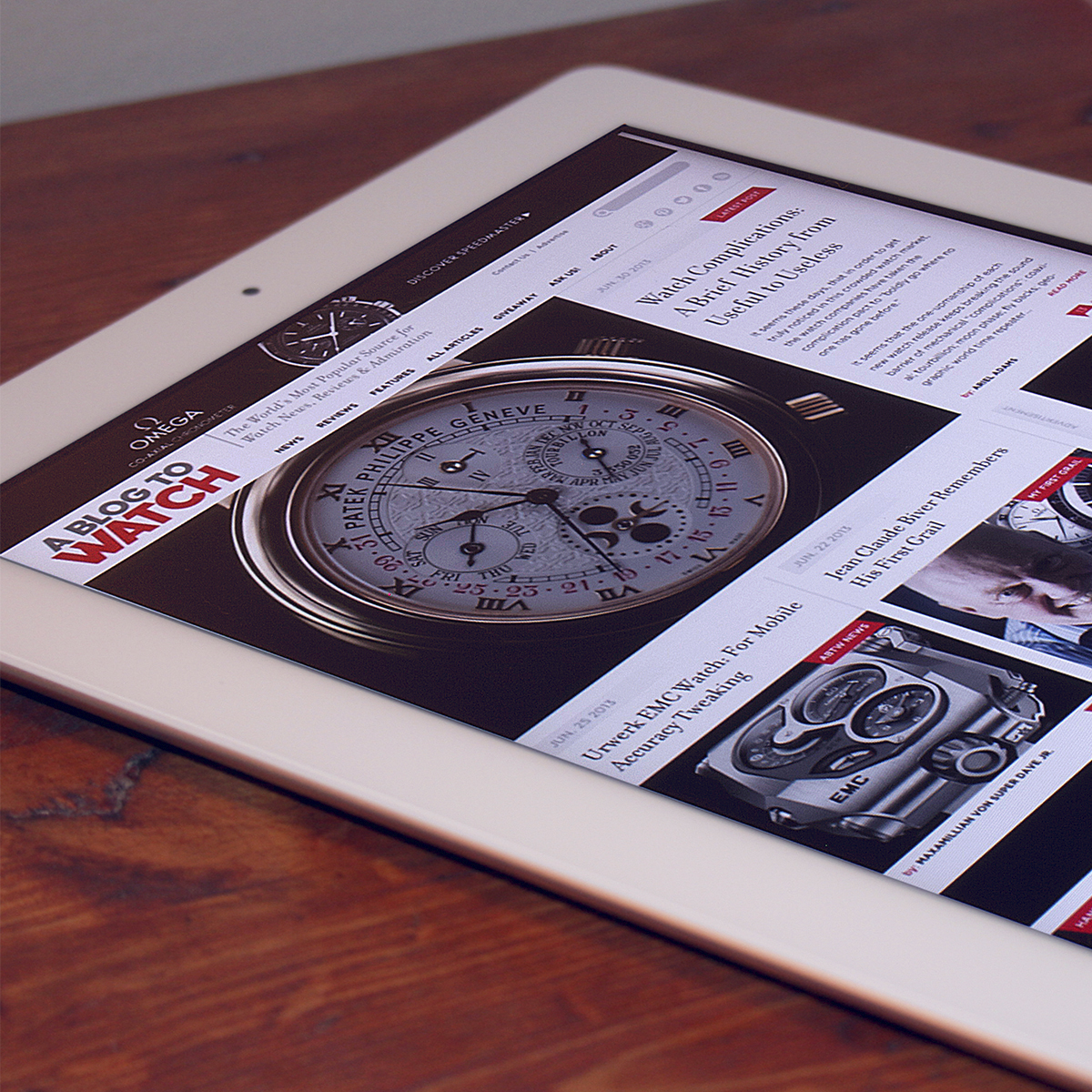
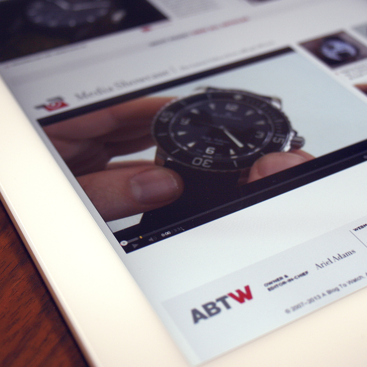
A project that went from “the front stage to the loading dock”, ABTW was a brand refresh that reset the entire business structure. The logo, website, visual language, merchandise, media sales and strategy were all examined and rebuilt. The result was not only a tremendous growth in traffic, but new partnerships with brands and advertisers within the watch industry.
The Logo
For A Blog To Watch, an already recognized entity in watch media, a typographic reset of their brand was the appropriate action. We crafted and set the logo in both a full length and abbreviated version for the widespread variety of applications that were required.

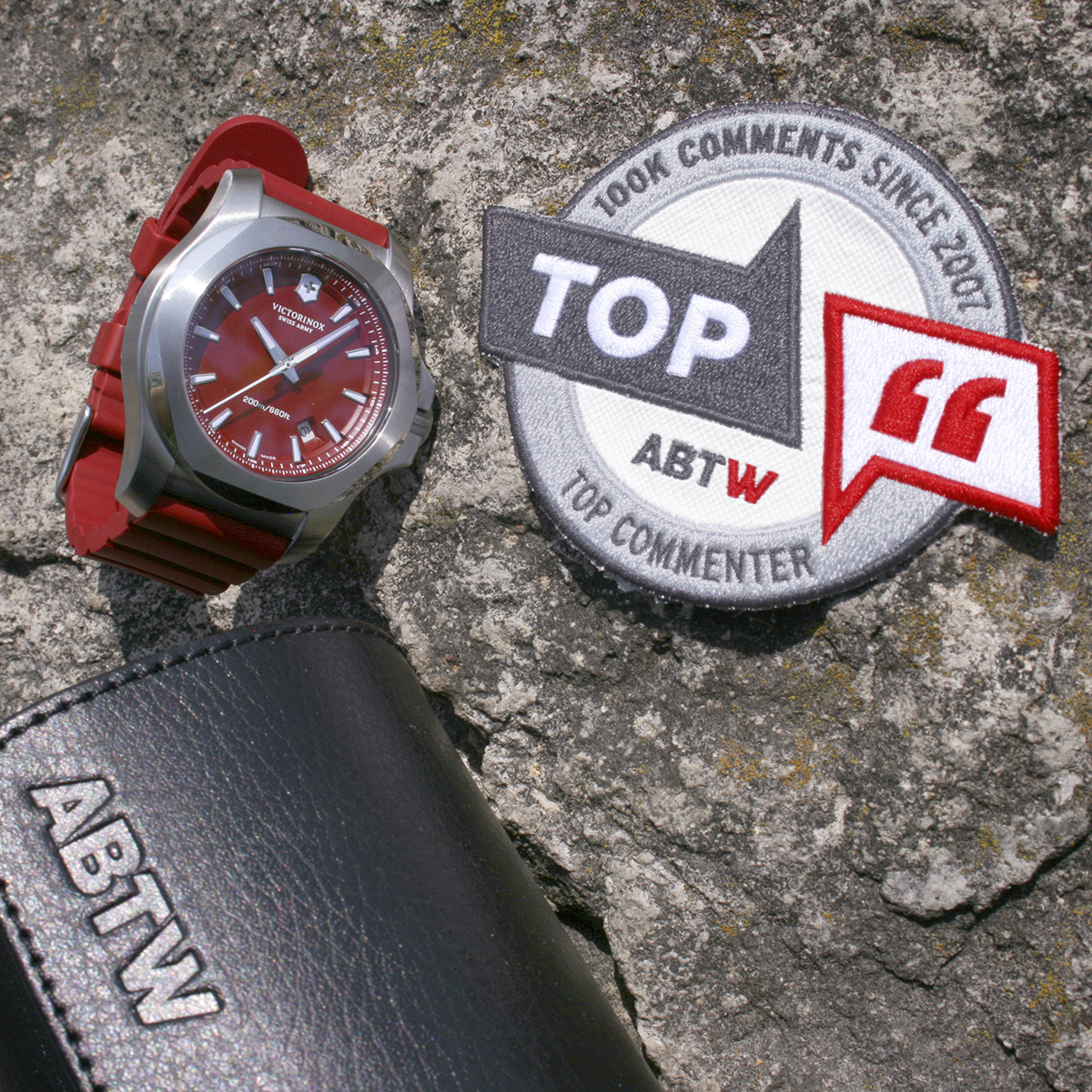
The abbreviated version worked well on much of the ABTW merchandise and collaborative items that were created during various content partnerships. It also served as an educational for the audience so that a uniform brand acronym could proliferate social media, whereas prior, there was a surprising amount of variation. BTW, Blog2Watch, B2W, ABTR (from their original domain ablogtoread.com) were some of the scattershot abbreviations this helped clean up.



Stylish Stuff
We also created a familiar visual style that could be applied to various icons and symbols as needed. We could later use these icons as primary elements while maintaining brand recognition.
